


Empatica creates the world's smallest and most accurate wearable devices for medical research and epilepsy management. My task was to rebrand and reshape the feel and look of the existing brand, refine the communication and help to launch a new model of smartwatch on the market.
Services:
Brand Concept and Strategy, Brand Identity, Brand Guidelines, Packaging Design, Fundraising Campaign Design, and Marketing Assets Development.
Result:
Empatica's newest smartwatch Embrace has been funded by 514% on Indiegogo and successfully launched on the market helping children and adults live a better life with epilepsy. In 2018 Embrace become the first smartwatch that has FDA clearance.
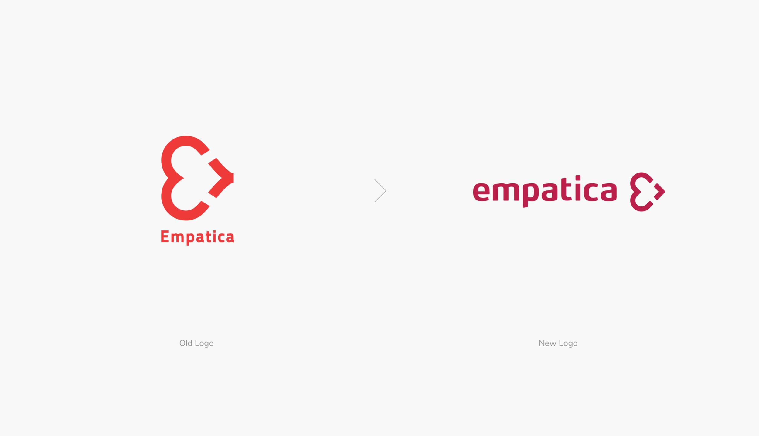
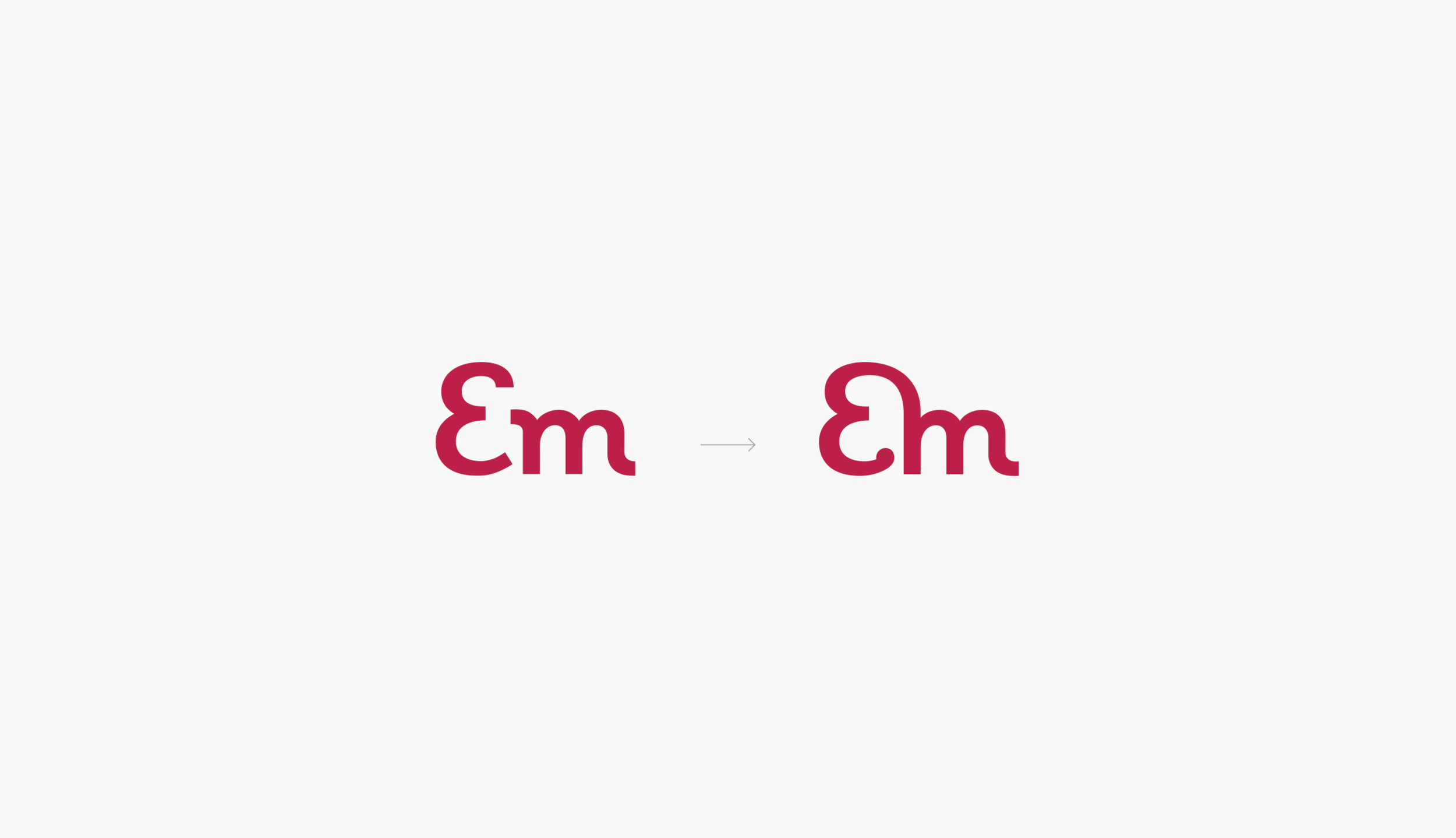
Here is where I started from. The old version of the brand mark was outdated and needed some refinement. The construction of the symbol has to be more structured with more balanced proportions. Also, the big brand mark was visually pressing the small lettering at the bottom, and the logo needed to be optimized for use in small sizes. The tint of red was flippant and lacking in maturity.
After defining the brand strategy, I started with the broad exploration of what the new brand mark for Empatica could be with the “heart” and “E” letter at the core of the concept.
We liked the new concepts, but there was still potential in the old mark. So I worked on improving and refining the original symbol in parallel. The goal to keep the heritage and recognition on the market won.
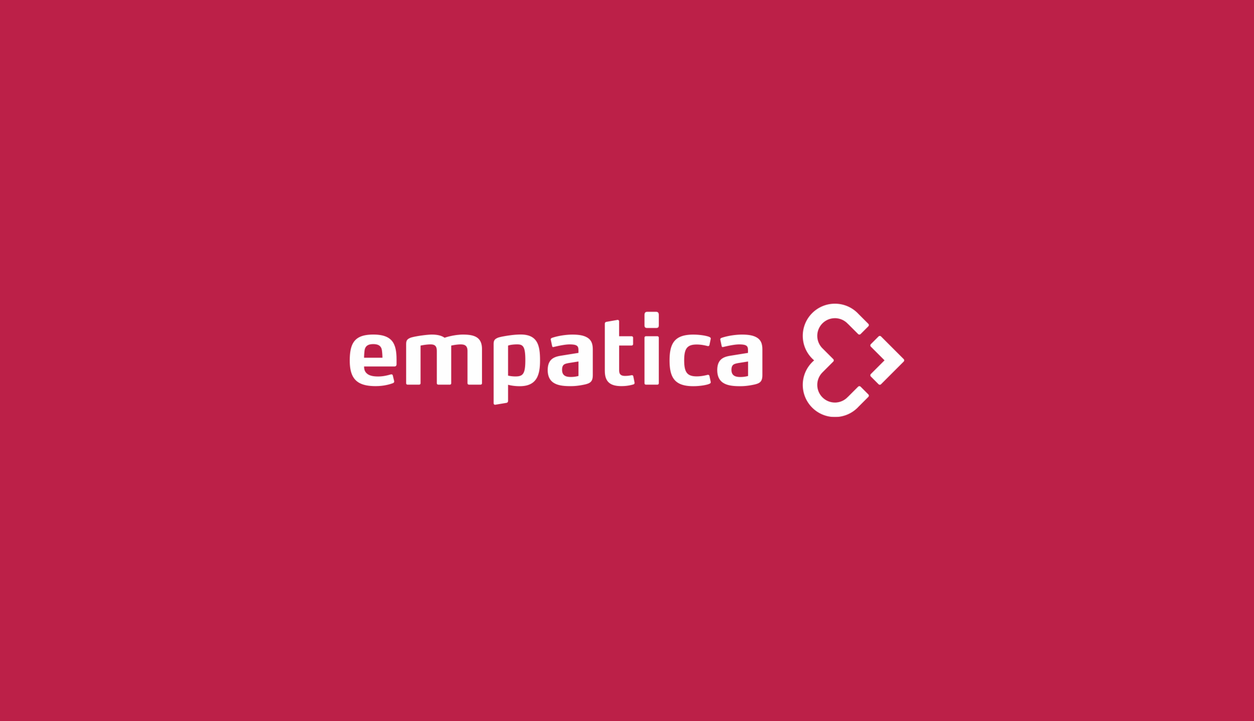
The new red color represents Empatica as a vibrant, but now more mature and confident company at the same time.
The new and refined brand mark looks recognizable, simple, and memorable.
The new lettering is more human, soft, empathic, and sharing the same DNA with the brand mark.
Embrace
The new model of the smartwatch needed a more human name. We were thinking about the brand as a good friend, that is always around, ready to help, always protect, newer judge. That’s how I come up with the "Embrace" name. The smartwatch is embracing your wrist as a good friend is embracing your shoulder, empowering you to stay confident, loved, and accepted.
How to illustrate an embrace with just letters? Maybe when one letter is literally embracing and supporting another one.